Hello guys
i will tell you a website amazing bubble automatic scrolling effect with using HTML and CSS only.

Lets start
1) open your notepad and other editor in your computer.
2) Write html code
and also create External Style sheet in your notepad and atteched with your html page with using
<link rel="stylesheet" type="text/css" href="Your-file -name.css">
tag in your head section. and don't forget his extension write .css.
3)Know Lets start cooding
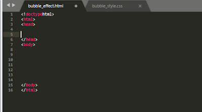
write your body section
<ul class="bubbles">
<li></li>
<li></li>
<li></li>
<li></li>
<li></li>
<li></li>
<li></li>
<li></li>
<li></li>
</ul>
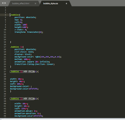
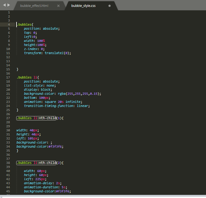
Know Copy this code write in Your style sheet
body{
background-color:black;
}
.bubbles{
position: absolute;
top: 0;
left:0;
width: 100%
height:100%;
z-index: 0;
transform: translateZ(0);
}
.bubbles li{
position: absolute;
list-style: none;
display: block;
background-color: rgba(255,255,255,0.15);
bottom: 100px;
animation: square 20s infinite;
transition-timing-function: linear;
}
.bubbles li:nth-child(1){
width: 40px;
height: 40px;
left: 105px;
background-color: ;
background-color:#f3f3f6;
}
.bubbles li:nth-child(2){
width: 60px;
height: 60px;
left: 225px;
animation-delay: 2s;
animation-duration: 5s;
background-color:#f3f3f6;
}
.bubbles li:nth-child(3){
width: 70px;
height: 70px;
left: 15px;
animation-delay: 3s;
animation-duration: 13s;
background-color:#f3f3f6;
}
.bubbles li:nth-child(4){
width: 50px;
height: 50px;
left: 750px;
animation-delay: 4s;
animation-duration: 17s;
background-color:#f3f3f6;
}
.bubbles li:nth-child(5){
width: 90px;
height: 90px;
left: 480px;
animation-delay: 6s;
animation-duration: 10s;
background-color:#f3f3f6;
}
/* If you want to create many bubble then you have to increase li Tag in page and
li:nth-chld( li-count){
write same code but another value
} */
@keyframes square{
0% {
-webkit-transform: translateY(0);
transform: translateY(0);
}
100% {
-webkit-transform: translateY(1080px) rotate(630deg);
transform: translateY(1080px) rotate(630deg);
}
}
Thanku for reading my blog...
i will tell you a website amazing bubble automatic scrolling effect with using HTML and CSS only.

Lets start
1) open your notepad and other editor in your computer.
2) Write html code

and also create External Style sheet in your notepad and atteched with your html page with using
<link rel="stylesheet" type="text/css" href="Your-file -name.css">
tag in your head section. and don't forget his extension write .css.
3)Know Lets start cooding
write your body section
<ul class="bubbles">
<li></li>
<li></li>
<li></li>
<li></li>
<li></li>
<li></li>
<li></li>
<li></li>
<li></li>
</ul>
 |
| Your html Show Like THIS |
In my html sheet i give name of Ul Class name is bubbles.
Know Copy this code write in Your style sheet
body{
background-color:black;
}
.bubbles{
position: absolute;
top: 0;
left:0;
width: 100%
height:100%;
z-index: 0;
transform: translateZ(0);
}
.bubbles li{
position: absolute;
list-style: none;
display: block;
background-color: rgba(255,255,255,0.15);
bottom: 100px;
animation: square 20s infinite;
transition-timing-function: linear;
}
.bubbles li:nth-child(1){
width: 40px;
height: 40px;
left: 105px;
background-color: ;
background-color:#f3f3f6;
}
.bubbles li:nth-child(2){
width: 60px;
height: 60px;
left: 225px;
animation-delay: 2s;
animation-duration: 5s;
background-color:#f3f3f6;
}
.bubbles li:nth-child(3){
width: 70px;
height: 70px;
left: 15px;
animation-delay: 3s;
animation-duration: 13s;
background-color:#f3f3f6;
}
.bubbles li:nth-child(4){
width: 50px;
height: 50px;
left: 750px;
animation-delay: 4s;
animation-duration: 17s;
background-color:#f3f3f6;
}
.bubbles li:nth-child(5){
width: 90px;
height: 90px;
left: 480px;
animation-delay: 6s;
animation-duration: 10s;
background-color:#f3f3f6;
}
/* If you want to create many bubble then you have to increase li Tag in page and
li:nth-chld( li-count){
write same code but another value
} */
@keyframes square{
0% {
-webkit-transform: translateY(0);
transform: translateY(0);
}
100% {
-webkit-transform: translateY(1080px) rotate(630deg);
transform: translateY(1080px) rotate(630deg);
}
}
Thanku for reading my blog...


